Your LinkedIn profile is often the first impression you make in the professional world. Before someone reads your experience, skills, or achievements, they see your profile visual identity. One of the most overlooked but powerful parts of that identity is your LinkedIn background banner.
Many people focus only on profile pictures and headlines, but the background banner plays a silent yet powerful role in shaping perception. It communicates your personal brand, professionalism, and even your career direction in just a few seconds.
In this guide, you will learn everything you need to know about LinkedIn background banners including the correct size, design principles, creative ideas, common mistakes, and best practices for 2026. Whether you are a job seeker, freelancer, business owner, or professional looking to stand out, this guide will help you transform your profile into a strong personal branding asset.
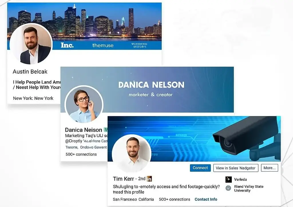
A LinkedIn background banner is the wide image displayed at the top of your profile behind your profile picture. It is the largest visual element on your LinkedIn page and acts like a digital billboard for your personal brand. While many users leave it blank or use a random image, professionals who understand branding use this space strategically.
Here is why it matters:
Think of it as your professional identity statement without words. A well designed banner can make your profile feel complete and intentional, while a poor or missing banner can make it look unfinished.
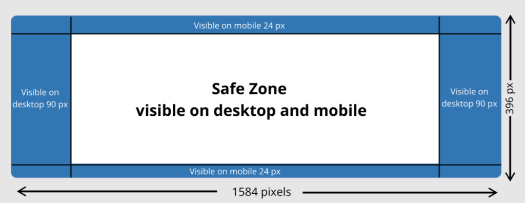
One of the most common mistakes people make is using the wrong image size, which results in cropping or poor display quality. The recommended size for LinkedIn background banners in 2026 is:
1584 x 396 pixels
This dimension ensures your banner displays properly across desktop and mobile devices without important elements being cut off.
When designing your banner, keep in mind:
It is also important to use high resolution images so your banner does not appear blurry or pixelated.
A strong LinkedIn banner is not just about visuals. It is about communication and clarity. Here are some essential design principles to follow:
Avoid clutter. A clean design is easier to understand and looks more professional.
Your banner should reflect who you are professionally. For example, a marketer might use growth visuals, while a designer might use creative layouts.
If you include text, make sure it is short, bold, and easy to read on both desktop and mobile.
Do not overload one side of the banner. Spread elements evenly so the design feels balanced.
A corporate professional should use a different style compared to a creative freelancer or entrepreneur.
If you are not sure what to use for your banner, here are some effective ideas that work across different industries.
Show your job title, expertise, or role in a clean and minimal style.
Use imagery that represents your field such as technology, marketing, finance, or healthcare.
Add a short motivational or professional statement that reflects your mindset.
Display subtle samples of your work if you are in design, development, or creative fields.
If you own a business, include your logo and brand colors to build recognition.
Highlight certifications, awards, or milestones in a simple visual format.
Use gradients, shapes, or soft patterns for a modern professional look.
Mention your city or region to build local credibility and networking relevance.
Encourage profile visitors to connect, collaborate, or visit your website.
Use neutral colors and structured layouts for a polished executive look.
Many LinkedIn profiles fail to create impact because of simple mistakes. Avoid these issues:
A blank banner makes your profile look incomplete and unprofessional.
Blurry or stretched images reduce credibility instantly.
Too much text or too many visuals make the banner confusing.
Many users check LinkedIn on mobile, so your banner must be mobile friendly.
Random wallpapers or unrelated pictures do not support your professional image.
To maximize impact, follow these best practices:
Use colors and styles that match your profile picture and overall personal brand.
Your banner should communicate one main idea, not multiple messages.
Refresh your banner when your role, skills, or goals change.
Always design in high resolution to ensure clarity across all devices.
If you are job hunting, your banner should reflect your target industry or role.
Creating a professional banner does not require advanced design skills. You can use simple design tools to create effective visuals.
Follow these steps:
The key is simplicity and clarity rather than complexity.
Your LinkedIn background banner is one of the most powerful yet underused branding tools available on your profile. It is the first visual impression people get when they visit your page, and it can strongly influence how they perceive your professionalism.
By using the correct size, applying clean design principles, avoiding common mistakes, and following best practices, you can turn your banner into a strong personal branding asset.
In 2026, competition on LinkedIn continues to grow, and small details like your background banner can make a significant difference in how you are perceived by recruiters, clients, and industry peers.
If you invest time in creating a thoughtful and well designed banner, you are not just improving your profile appearance, you are strengthening your professional identity.